Discussion Point 1: Visual Hierarchy & Grids
By Alison Leach
Question -
How has use of visual hierarchy and grid evolved with the emergence of digital technologies over the traditions qualities and potential constraints inherent in letterpress? Find 2 examples to compare and contrast.
Throughout time through the emergence of digital technologies, visual hierarchy and grids have evolved. As we step over the traditional qualities we have been opened to new innovative concepts. With traditional concepts, designers had built upon the conventional ideas however as time progressed the emergence of digital technologies has created a diverse range of flexibility and innovation with design and designers of today.
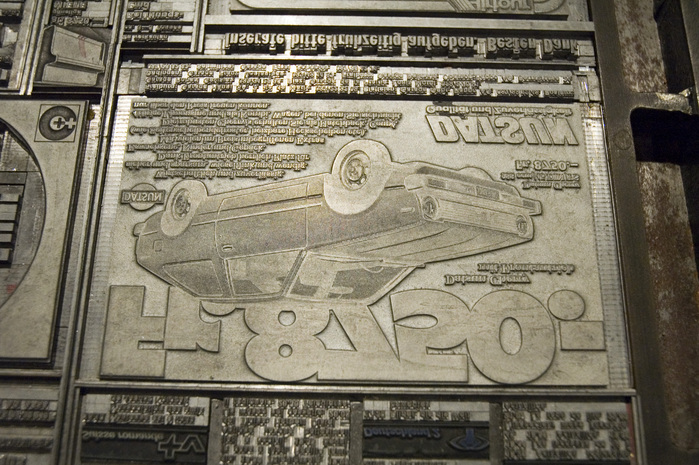
The traditions of letterpress allowed for constraints such as, line height and font/typeface. The designs were simple and unlike today didn't flow freely. Through the emergence of software design suites such as the Adobe Series, the range of grids and use of designs has come endless.
Here is an example of a simple layout with a traditional woodblock letterpress. The layout and design is simple and separate, it has no movement or images/visual. The grid is made up of 5 vertical columns which hold the simple design.
From the two we can clearing see how the emergence of technologies have assisted in bringing back innovation into design of today. The designs are now able to be more flexible and less traditional.Although grids create control to a design, they allow for design layouts to be tested and allow for visual hierarchy to be illustrated.


No comments:
Post a Comment
Note: Only a member of this blog may post a comment.