Sunday, August 26, 2012
Drop Box Invites
I've just sent out Dropbox invitations to everyone so anyone who hasn't got Dropbox yet should get an email invite with links and info on how to get into using Dropbox.
Great Assessment Today
Hello Everyone,
Great assignments today. Very high standard. I forgot to mention today that first week back if you could all bring in your favorite magazine. We will have a discussion about page layouts, target markets and what makes these publications successful.
Also for the motion graphics students, I thought I would attack this great clip from a new Sydney band called The Money Go Round. Very nice clip.
Enjoy your break
Lauren
Week 7: Time to get ready for your new project
Well - hopefully you've been able to provide Lauren with a strong response to the first project of this elective. I'm looking forward to checking out what you have been up to.
However this week as we head for the Semester break here at COFA it's time to:
1. Check out the new online lecture about Style Guides for publications both print and screen based publications. You'll find the document located here.
2. The second task is to begin to familiarise yourself with the new group project that will become the focus of your work over the rest of the semester. The task is of course to design a new issue of the elective online and downloadable magazine ffi. As I mentioned in my previous post last week you can check out some previous issues over on the Essential Reading page of the blog. Here's a link to one issue to make that even easier to see.
As stated in the Brief:
Project 2 asks you to collaborate and work as a design
studio for the development of a downloadable online publication. Each of you
will undertake a role within a team to develop, design and publish an online
publication. Discussion about individual design strengths and interests will
assist each of you nominating roles and developing a set of tasks you regard as
appropriate for each role. The objective is to get the publication ready for
online distribution in Week 12!
The focus of the
publication content is up to the group to decide but is located within the
scale and scope of typographic practice. You/the team could consider including
issues derived from current affairs, sustainability, design issues, etc.
Essentially this is up to the group to decide. You are also to introduce design
elements generated using 3D printing and the Letterpress Studio. Resources will
be made available to enable this to be integrated into the project process.
The publication will be published as a new issue of ffi
– an emerging online publication/web magazine dedicated to typography and run
by teams of designers from the course SDES2198 at COFA. ffi is published annually
online.
You may be wondering how you'll all manage to collectively create a magazine when you only meet for a few hours each week. The process over the years that this project has been running has evolved but has remained steadfastly mediated by online processes. This semester as was the case last semester we'll be using Dropbox which is an online platform for sharing files. You are also of course free to use the blog as a means to communicate throughout the process as well.
Ok that's a lot to soak up - have a great week and a great semester break!
Ok that's a lot to soak up - have a great week and a great semester break!
Sunday, August 19, 2012
Week 6 - check this out!
A Type Primer
As Project 1 comes to a close take the time to persuse this seven minute video primer on typography. It's amongst the best online content we've seen come to light on type. The content covers insights and really practical advice and the work referred to ranges from mainstream to cutting edge innovation and new ways type is being used to present data.
I think as you begin to familiarise yourself with the upcoming group project looking at as much diverse material about type as possible will inform you and the wider group in the best way. You'll be defining a direction to go in as a collective so this is actually important. Fortunately there is more and more video material out there to assist you. We'll keep posting - you do some digging too. Feel free to post relevant material you find at all times. The more we share the more we all learn in his context.
With the upcoming project in mind it's probably a good time to remind you to have a look at the work of previous groups so you can get a sense of what is expected of you. The last issue of the course online magazine ffi is full of interesting takes on typography - from graffiti to cartography, the London Underground to letterpress, so it's really worth a look. You can check out a lot of other good material over at the page Essential Reading on this blog including The Pressing Issue - another great online publication issue developed in this course.
Finally next week is the deadline for Project 1 so do ensure you are ready for this and have covered all the assessment criteria outlined in my previous post (below).
Monday, August 13, 2012
Week 5 - How brilliant!
Firstly I must say the excursion to the Distillery looks like it was excellent fun! A great post from Lauren too.
This week and next week are all about refining and finalising your response to Project 1. We hope you've found the process a rewarding one. I note there was some confusion about when the deadline to Project 1 actually is, however as Lauren has clarified we will go with Week 7 as the final deadline for Project 1.
Last week I began to focus your attention on the design considerations. This week I want to reitterate the importance of also considering the the Assessment Criteria which are as follows.
Please ensure you are taking them into account when preparing your submission for
Project 1 - Letterpress Booklet.
This week's additional resource is a very nicely put together short film about letterpress.
Do check it out.
Letterpress from Naomie Ross on Vimeo.
Stay tuned. See you next week.
This week and next week are all about refining and finalising your response to Project 1. We hope you've found the process a rewarding one. I note there was some confusion about when the deadline to Project 1 actually is, however as Lauren has clarified we will go with Week 7 as the final deadline for Project 1.
Last week I began to focus your attention on the design considerations. This week I want to reitterate the importance of also considering the the Assessment Criteria which are as follows.
Please ensure you are taking them into account when preparing your submission for
Project 1 - Letterpress Booklet.
Assessment Criteria:
|
EXCELLENT
|
GOOD
|
AVERAGE
|
VARIABLE
|
POOR
|
Studio Research (20%)
|
|||||
Demonstrated understanding of a range
of historical and contemporary approaches to letterpress typography.
|
|||||
Evidence of understanding of visual hierarchy for
typographic designs in print
|
|||||
Design Concept (40%)
|
|||||
Documentation of experiments with conventions and
innovation in print publication design using advanced typographic structures.
|
|||||
Effective contributions to
discussions about diverse cultural associations communicated by letterpress
typographic treatments.
|
|||||
Presentation of innovative typographic concepts that
address current issues.
|
|||||
Designed proposal
for letterpress printing produced as a Rapid Prototype letterform.
|
|||||
Design Synthesis (20%)
|
|||||
Designed outcomes that address a deadline, budget, and
the needs of an identified audience.
|
|||||
Worked collaboratively in groups for print publication
production.
|
|||||
Design Presentation (20%)
|
|||||
Prepared and presented prototypes of typographic
letterpress publication designs at an advanced level.
|
This week's additional resource is a very nicely put together short film about letterpress.
Do check it out.
Letterpress from Naomie Ross on Vimeo.
Stay tuned. See you next week.
Tuesday, August 7, 2012
The Disterilly
Hello everyone,
What an amazing excursion to the Distillery. Very inspiring, and im sure you will all agree we learnt alot. A huge thank you to Nathan and Elise and the Distillery team for having us, and taking time out of their busy schedule to show us around their studio. It was great to see the presses in action, and to be able to take home some samples. I'm sure their will be a few of us visiting the Distillery in the future to get some business cards made. Here are some photos from the day.


What an amazing excursion to the Distillery. Very inspiring, and im sure you will all agree we learnt alot. A huge thank you to Nathan and Elise and the Distillery team for having us, and taking time out of their busy schedule to show us around their studio. It was great to see the presses in action, and to be able to take home some samples. I'm sure their will be a few of us visiting the Distillery in the future to get some business cards made. Here are some photos from the day.


Monday, August 6, 2012
Welcome back - Week 4 already!
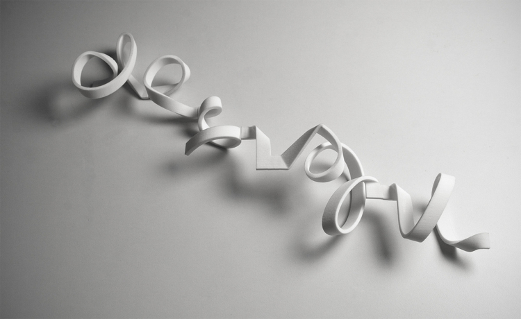
Having begun to work on your own experiments with the process, and in combination with the excursion to The Distillery, you are now beginning to become familiar with some of the basic techniques of Letterpress Printing. With this in mind I would like also the get you thinking about how the tools, process and techniques of Letterpress might be combined with new approaches to making and typographic practice such as Rapid Prototyping.
The above image is from an interesting article exploring just this.
There is plenty to do of course. Some of you are yet to post your material about your selected typeface. The post we have are all very informative and build the content here nicely. Then there's the current studio project. Although that deadline seems a few weeks off, time is acually pretty tight in the studio and it's crucial to use the time to focus on the refinement of your design for
Project 1.
These are the things to keep in mind as you prepare the final submission over the coming weeks:
Ok, have a good week and do let us know if you have any questions or problems with the current project.
 | ||
| http://www.fastcodesign.com/1662896/freedom-of-creation-unveils-customizable-3-d-font |
The above image is from an interesting article exploring just this.
The Dutch rapid-prototyping juggernaut Freedom of Creation has released an arty new font designed explicitly to be printed in 3-D. The result is a snaking, spiraling, sinewy typographic sculpture that's totally customizable and would look right at home on the mantle.Ok, sticking with the use of new technologies within experimental typographic practices these images (above) and videos showing experiments with 3D Printing and sculptural graffitti are quite interesting - at the least showing us the potential of creating complex forms that might be deployed in letterpress.
 |
| http://helloantique.blogspot.com.au/2010/05/3d-print-of-graffiti.html |
These are the things to keep in mind as you prepare the final submission over the coming weeks:
In the project ‘Letterpress Booklet’ you will engage with notions of ‘typographic voice’ and specialist
type history. The booklet shall present three newspaper headlines you are asked to modify and layout to
express an aspect of contemporary media experiences.
Each page of the booklet will be a single-colour design printed on two sides, which demonstrates an
advanced knowledge of display typography, and an understanding of the history of the design
surrounding your chosen types.
Design Specifications:
— Demonstrate the application of illustrative/display typography
— Size: self-directed (consider an appropriate size for your chase, type, etc.)
— You may explore different materials for printing on, suited to your design
— Single colour design, printed on 2 sides
— The postcard will be printed in wood type
—
A considered design which includes visual hierarchy, scale &
proportions, word spacing,
line-spacing and letter spacing, etc.)
line-spacing and letter spacing, etc.)
Although
the research and concept development have been evolving over the
duration of the project
to date remember that we will be assessing the whole as a package including your work in the earlier
stages. Don't neglect the Assessment Criteria.
to date remember that we will be assessing the whole as a package including your work in the earlier
stages. Don't neglect the Assessment Criteria.
Assessment
|
PROJECT 1: LETTERPRESS Booklet
Studio Research
Concept
Synthesis
Presentation
|
Ok, have a good week and do let us know if you have any questions or problems with the current project.
Wednesday, August 1, 2012
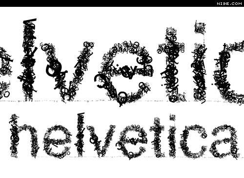
Helvetica_Felicity Riley
Typeface:
Helvetica
Helvetica originated in
Switzerland in 1957 and was designed by Max Miedinger and Eduard Hoffmann at
the Haas type foundry. This sans
serif font was originally named Die Neue Haas Grotesk, it was changed to
Helvetica in 1960 which is Latin for Swiss.
Helvetica was designed
to be neutral as it was based on the principle that “type itself should give no meaning.” Companies were looking for change after the European war and
to deviate away from the decorative and loud that had been used in
advertisements.
Although this type was
originally designed to inherently convey no meaning, it now represents
corporate culture and business because of its adaptability. Helvetica is clear,
direct and instantly legible, which is the backbone of most corporations; why
not use a type that reflects a mission statement, whilst simultaneously
advertising.
“Helvetica’s
sleek lines and modern sensibilities were just what companies were looking for
to remake their identities and set themselves apart from the past.” [1]
Helvetica is classified
as a transitional or anonymous sans serif with vertical and horizontal
terminations on their strokes and is as much about the negative space then
about the lines, whilst having monotone stroke weights.
Another interesting fact
is that the type remains legible whilst in motion which is a key factor for its
use in transportation signage and placement on moving objects.
“…a font that rides the line
between classic and modern, conservative and edgy, or elegant and relaxed,
Helvetica might just be your answer.”[2]
Helvetica is usually
categorized as a safe font, it doesn’t tend to influence the other elements
within a design, and it is clear and communicates the text/brand simply and
explicitly. Examples-Nestle, Toyota, Microsoft, Target, American Apparel,
American Airlines, Post-It, 3M, Skype, BMW, Panasonic, GM, Motorola,
Harley-Davidson, Tupperware, NYC Subway.
As a result of its
neutrality it is easily read without being disturbed with serifs or decorative
flicks, users just read and absorb. Although its modern (as it does not use
serifs) it’s not aggressive or overly harsh, it doesn’t shout the message, it
just simply communicates it. This is one of the reasons that it will work in my
letterpress. I can build on its impartiality. It will not interfere with m
design, but will enhance its understanding.
References

Subscribe to:
Comments (Atom)