Tuesday, July 31, 2012

SR1 - Sandra Stepien

Bodoni is a series of serif typefaces designed by Giambattista Bodoni (1740–1813) in 1798 that today we classify as Modern. Often remarked as "the father of modern type"1 Bodoni was an Italian engraver, publisher, printer and typographer of high repute who came from a printmaking background. The son of a printer, he first served as an apprentice at the Propaganda Fide printing house in Rome and was later hired by the Duke Ferdinand of Bourbon-Parma where he achieved an unprecedented level of technical refinement due to his meticulous design and print quality. Eventually his success from printing many important works led him to open his own printing house in 1791, Officina Bodoni2

During his early career Bodoni first orientated himself towards the fonts of Pierre Fournier but soon developed his own original typefaces. Bodoni abandoned the forerunning Old Style typefaces and drew influence from the high stroke contrast which marked the types of John Baskerville, for whom he showed great admiration for. Bodoni however, took the design to a more extreme, clinical conclusion as he believed that well-designed type derived its beauty from four principles: uniformity of design, sharpness and neatness, good taste, and charm3.


Bodoni’s original typeface, along with many of its later interpretations, is a romantic font that is easily identifiable by thin, hairline strokes that contrast sharply with bold stems. Additional defining qualities include crisp vertical stress and un-bracketed serifs although some letters possess soft bracketing such as the uppercase letters R and S. The result is a typeface celebrating simplified, geometric shapes with a classic and refined demeanour. His plain and unadorned aesthetic attracted many admirers and imitators and ultimately gained worldwide acceptance among printers.

Due to the thin, peculiar qualities of its letters, Bodoni is not an easy typeface to use. Its extreme contrast coupled with the strong vertical stress is not suited for body copy text as the vertical nature of the letters impedes with the horizontal flow of reading. Interestingly, William Morris described Bodoni as “sweltering hideousness” and “the most illegible type that was ever cut”4 and failed to see any use for it. However that said, it is  advised that for best results and legibility, Bodoni should be set large enough so that the hairlines are preserved, ample white space is given and additional leading and generous margins are provided. Its limited range of functions is confined to headlines, logos and fashion magazines however, when used well; Bodoni almost always makes a refined, polish and sophisticated statement.

Top to Bottom: Armani Exchange (Fashion), Calvin Klein (Fashion), Elizabeth Arden (Cosmetics)


Bauer Bodoni Black used as CMU's wordmark

Bodoni used for titles on calenders

Today Bodoni exists in many modern interpretations such as Bodoni Classic, ITC Bodoni™ Filosophia, and Lanston Bodoni. However, whatever the application or type, Bodoni will always show a radical movement in typography history and exude elegance, luxury and quality.


References
1 Thomas Christensen, accessed 20 July 2012, <http://www.rightreading.com/typehead/bodoni.htm#history>
2 John Boardley 2008, accessed 21 July 2012, <http://ilovetypography.com/2008/05/30/a-brief-history-of-type-part-4/>
3 Taschen 2012, accessed 18 July 2012, <http://www.taschen.com/pages/en/catalogue/design/all/05059/facts.bodoni_manual_of_typography_manuale_tipografico_1818.htm>
4 The Art and Craft of Printing 2012, accessed 20 July, <http://ebooks.adelaide.edu.au/m/morris/william/art-and-craft-of-printing/chapter4.html>

Jessica Lightfoot - 3291241 'Mrs. Eaves' Typeface Critique - SR1


Monday, July 30, 2012

IMPORTANT INFO re: Next Week's Excursion

Hi everyone. As you know next week is the excursion to The Distillery. This is a great opportunity to see the print process and get a bit hands on as well.

With this in mind we need you to download and fill out the relevant COFA OH&S form. Follow the links to see the policies for field trips. The form we need you to fill out is the Fieldwork authorisation and medical questionnaire.

Please download it and fill out to bring to studio next week.

In the meantime have a look at this neat video on The Distillery...

Letterpress arrives in Sydney, Australia from The Distillery on Vimeo.

Week 3 and it looks like we are making progress!

Hi everyone, it's great to see that many of you (14 so far) have been able to respond to the blogger invitation to author content. I know there are a few who need new invites and these will come through today.

The content posted so far is looking good although I note there are some 'bad links' to images that might need some editing. It's important to pay attention to these details in any publishing context.

It's already clear I think, that already we have begun to develop quite an informative compendium of information about typefaces that enjoy popular currency in graphic design and publishing contexts. The imagery is vibrant and the examples are relevant to our study area. Well done everyone whose posted so far! Lauren told me that a lot of work was dine before the blog invites came through correctly so when you get the chance please do post the material here.

Wondering how Letterpress relates to contemporary deployment of type? We know letterpress is kind of cool/trendy in recent years - sort of like the typographic equivalent of vinyl records - but how might it link to a more hi-tech application of typography. Have a look at this project on the crowdfunding website Kickstarter - very interesting...


The focus of this week is right on getting to grips with your design and the letterpress process in the studio. As expressed in the course notes it says:

Studio:Letterpress technique. Continue composition and printing of letterpress booklet.
Self-Directed:Refine selected designs for printing in next class.

Have a great week!

PS: If anyone is having trouble with the blog, not getting updates etc. (or any other aspect of the studio) please do get in touch so we can sort you out :)

Andrea Agathocleous z3332101 Papyrus


PAPYRUS

As a rustic font that has been seen everywhere from homemade invitations to blockbuster posters, Papyrus is definitely one to be discussed.

Developed by Chris Costello, a designer, illustrator and web designer in 1983[1], the font was originally designed by hand with a calligraphy pen on textured paper[2]. Inspired by the texture of the Papyrus paper of the Ancient Egyptians, the font that seeps much culture demanded instant attraction due to its distinctiveness and inimitability. As of present, the International Typeface Cooperation currently owns Papyrus2.


4


As exemplified in the sample above, Papyrus is a Roman Sans-Serif font that falls in the Ornamental class.  Characteristics include high strokes in the capitals, irregular curves and jagged edges2.  

Much like it’s notorious peer, Comic Sans MS, Papyrus has fallen victim to constant scrutiny due to its overuse and exploitation in the design industry, a crime mostly convicted by the novice designer. Amusingly, the fonts own father, Chris Costello has himself slandered the font, accusing it of becoming “diluted” and having “lost its original appeal.”[3]

Unlike Comic Sans however, Papyrus has often slipped through the cracks (pun intended), shifting its prevalence from high school PowerPoint presentations and into surprisingly many logos and advertisements.

The font comes free with an environmental, calming and eastern feel, which gives it a renowned eminence in the logos of Yoga and Thai food places2.

Papyrus’ rise to fame does not end at mere branding at local small-scale food and health outlets, however. Its real rise to stardom arose from none other than Hollywood’s film and music industry itself. It’s appearance in heavy metal band ‘Lamb of God’s’ logo4 and its casting in the title of Joss Wehden’s 2005 film “Serenity” is enough to cause speculation – but it was not until 2009 where the worst had yet to come.

The most controversial case involving the use of Papyrus occurred in none other than James Cameron’s a blockbuster hit – AVATAR[4].  The font not only embellished the title in Promotional activity, much rather its presence was abundant even in the subtitles  - a position usually only reserved for the most modest sans-serif fonts to aid the eye of the viewer[5]. As exemplified in the image below, the font has been debatably overused in AVATAR due to its raw, earthly connotations.


While the font is often exposed to negative criticism due to its misuse, it is also condemned for its technicality. Moreover, its irregularity specifically with the fonts ligatures makes the kerning of the font quite difficult and near impossible for the designer to perfect. 

Conclusively, Papyrus is a controversial font that most designers can’t help but love to hate. As the best of the worst, Papyrus’ unique qualities and niche appeal mean that after almost 30 years this font is anything but a fad or a gimmick– and we will continue to see its use in years to come.


[1] Leurs, Laurens. "The Papyrus Font | 30 Typefaces - their look history & useage." Pre Pressure. N.p., 6 September 2011. Web. 17 Jul 2012. <http://www.prepressure.com/fonts/interesting/papyrus >.
[2] "Papyrus (typeface)." Wikipedia. N.p., 29 June 2012. Web. 17 Jul 2012. <http://en.wikipedia.org/wiki/Papyrus_(typeface)>.
[3] Travis, Estvold. "F is for Font | Investigating Boise's love affair with the prolific Papyrus | Visual Art." Boise Weekly. N.p., 25 June 2008. Web. 17 Jul 2012. <http://www.boiseweekly.com/boise/f-is-for-font/Content?oid=937144>.
[4] Dane, Carbaugh. "6 Awful Uses of the Papyrus Font in Major Logos." Dane Carbaugh. N.p., n.d. Web. 18 Jul 2012. <http://danecarbaugh.com/6-uses-of-the-papyrus-font-in-logos/>.
[5] "Pr*tty Sh*tty: An Open Letter to James Cameron." Pr*tty Sh*tty. N.p., 4 Jan 2010. Web. 18 Jul 2012. <http://prttyshttydesign.blogspot.com.au/2010/01/open-letter-to-james-cameron-from.html>.

Sunday, July 29, 2012

Alison Leach 3330825: Typeface Critique


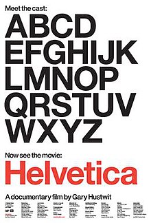
Helvetica is one of the most popular typefaces of all time. Swiss typeface designer, Max Miedinger was famous for designing the sans-serif typeface in 1957, firstly naming it Neue Haas Grotesk. In 1960, Miedinger renamed the typeface Helvetica; the Latin name for Switzerland and from them on it was global.

The Helvetica design is based on the grotesques of the late nineteenth century. However, with new refinements Helvetica has been put into the sans serif sub-category of neo-grotesque.  Not too long after the introduction to Helvetica the Stempel foundry purchased the original Helvetica typeface and then developed a full series of weights. Today Helvetica is defined as an all-purpose type design, which is able to convey practically any message effectively.


The traditional design of Helvetica had the stroke endings squared off, however Helvetica Rounded was soon after designed with rounded stroke terminations. Miedinger sought to create a font that did not sit or float in the background.  It is both the positive and negative space around the type itself which make the typeface look as if it is fixed to its background, with no possibility for movement.

To this day there has been a number of Helvetica variations created, including a number of different language variants. Each style consists of the same traditional design however with both heavier and lighter stoke weights. Variations such as Helvetica condensed and Helvetica compressed are largely used amongst display applications such as newspapers and headlines, billboards and advertising.

Helvetica was designed as a rational typeface for contemporary information. It is a neutral typeface and although Helvetica has many variants the basis of its structure follows the horizontal slicing off of the terminals. It is this neutrality, which makes the font so widely used, because it has no meaning for itself and allows for words and sentences to be able to relay their own message effectively without creating any interference. 

Although it can be argued that Helvetica has become so overused, Helvetica is still seen as one of the most popular body context fonts. Used by major companies such as Apple and NASA, some designers will argue that Helvetica has lost its power over the past fifty years because of its exhausted use while others will say it is the timeless nature of Helvetica which makes it a popular choice when choosing a typeface.

Works Cited

Bart, Zach. Zach's Blog. 12 11 2008. 21 07 2012 <http://zachbart.wordpress.com/2008/11/12/helvetica-critique/>.

Bitstream Inc. My Fonts. 03 12 2007. 21 07 2012 <http://www.myfonts.com/fonts/adobe/helvetica/>.

Chapman, Cameron. The Simplicity of Helvetica. 21 07 2012 <http://www.webdesignerdepot.com/2010/01/the-simplicity-of-helvetica/>.

McDonagh, Maitland. Helvetica: Review. 21 07 2012 <http://movies.tvguide.com/helvetica/review/290467>.

The New York Times. Helvetica: The little typeface that leaves a big mark . 01 04 2007. 21 07 2012 <http://www.nytimes.com/2007/03/30/style/30iht-design2.1.5085303.html>.

Saturday, July 28, 2012

Mrs. Eaves - Typeface Critique - Jaye Valery


Mrs. Eaves— Poster & Typeface Specimen Book


The transitional serif typeface, “Mrs. Eaves”, designed by Zuzana Licko in 1996, was designed to revive the traditional types created by English printer, John Baskerville. Upon encountering a great visual difference between letterpress and photographic type, Zuzana explored the idea of reviving an “old favorite” typeface that “challenged the common, pre conceived method of interpreting the classics” (Linko, 1996) Her decision to revive “Baskerville” derived from sympathy toward the heavily criticized typeface for being to sterile, stark and difficult to read. Zuzana aimed to create a modern adaption that eliminated the harsh edges while maintaining the same “openness and lightness” of the original typeface.

With a near vertical stress, “Mrs. Eaves’” lower case characters are of wider proportion than “Baskerville” to maintain a light and open feel; a feature, Linko claims, also reduces contrast. Linko has softened “Baskervilles” hard edges, consequentiality giving the typeface a more feminine feel. The “X” height has been reduced, to become relevant to the “Cap” height in an attempt to avoid increasing the set width, which would result in a more “clunky” aesthetic. A critique in Eye magazine believes “Mrs. Eaves” is a “Mix of tradition with an updated twist, familiar to be friendly, but different enough to be interesting.” I believe this is a really interesting way to look at it. 


Certain aspects of “Mrs. Eaves” completely contrast John Baskerville’s design intentions. In Simon Loxley’s book Type, the Secret History of Letters he states  “Baskerville was not an inventor but a perfector… He concentrated on spacing. He achieved amplitude not merely by handsome measurement but by letting in the light.” While Linko has kept true to the lightless of “Baskerville,” her type has been criticized for its spacing. Hrant .H. Papazian, wrote on the typophile forum, "The problem with Mrs. Eaves isn't just that the spacing is messy, it's that its overall loose spacing goes against all its other parameters, like the tiny x-height, and the lightish color.”  The characters are sometimes awkward looking and don’t seem to fit together, while the spacing is generally “too loose” for large body text, however Émigré observes that when used in the right circumstance it imparts a very particular feel that sets it clearly apart from many likeminded types. It has an undefined quality that resonates with people.”


Emigre 38 The Authentic Issue (1996)


“Mrs. Eaves” is licensed by the type foundry, owned and run by Licko and husband Rudy VanerLans, Emigre. Issue 38, The Authentic Issue, of Emigre Magazine first published “Mrs. Eaves” and used the type extensively throughout its content. Emigre’s type foundry has been significantly defined by the commercial and popular success of “Mrs. Eames.” 

Originally designed as a traditional text face, Emigre believes that “typefaces will find their own way” and sure enough, “Mrs. Eaves” found a presence in literary design. “Mrs. Eaves “ gives beautiful presence to small amounts of text and an elegancy to headlines, It makes the reader slow down a bit and contemplate the message.” (Emigre, 2010) 


Novel covers featuring “Mrs. Eaves”- Book archive. com


Mrs. Eaves adorns book covers, short blurbs, poetry books, CD covers, restaurant menus, and logos. My favorite use of “Mrs. Eaves” would have to be its magical presence on the spine of “Penguin Classics.”


References-

Images- http://pinterest.com - Last accessed 23/07/2012
Emigre 38, The Authentic Issue - http://www.emigre.com - Last accessed 21/07/2012
Mrs. Eaves- http://www.australianedge.net - Last accessed 21/07/2012
History of Mrs. Eaves- http://typedia.com - Last accessed 21/07/2012
Mark boultin, Mrs. Eaves History - http://www.markboulton.co.uk/journal - Last accessed 23/07/2012
Zuzana Licko, Mrs.Eaves - www.emigre.com - 19/07/2012
http://bookcoverarchive.com/typeface/mrs_eaves - 30/07/2012


Tuesday, July 24, 2012

Rockwell Font Critique - Rachel Brex


The Rockwell typeface is a slab-serif or “Egyptian” font that was heavily influenced by a font face called Litho Antique in 1910. Due to the popularity of this font and others like it, the American Type Founders reissued the font and in 1931 their chief type designer Morris Fuller Benton modified some of the characters to create Rockwell Antique. In 1934 Montoype works manager Frank Hinman Pierpont commissioned his studio to create and release the Rockwell typeface family. It was unique to its predecessors by including differences in spacing, letter weight and subtle changes in glyph formation.

The Rockwell typeface has a very geometric and linear construction. This is extremely prevalent in the apex of the uppercase ‘A’ and the deep serifs on uppercase ‘T’ and ‘L’. Both cases of the letter ‘o’ are almost perfect circles as opposed to the traditional sense of the letter, which is more of an ellipse. The Rockwell x-height is fairly high compared to other fonts and noticeably short descenders.

The typeface has nearly no contrast between thick and thin as the counters are in perfect proportion and the stroke width of each character is the same thickness of its serifs. This makes Rockwell a very suitable font for headlines rather than lengthy slabs of text because it conveys a sense of authority. It is also useful in other applications that require a strong, bold typeface as its visual impact can be fully exploited.

Being a slab serif font, Rockwell is reminiscent of old poster fonts and Western movie posters paraphernalia. “Slab Serifs are an outlier in the sense that they convey very specific — and yet often quite contradictory — associations: sometimes the thinker, sometimes the tough guy; sometimes the bully, sometimes the nerd; sometimes the urban sophisticate, sometimes the cowboy.” Modern uses of Rockwell include the Guinness Book of Records and the Docklands Light Railway.


One of my favourite uses is Jarratt Moody’s kinetic typography interpretation of a scene from Pulp Fiction. (if this is inappropriate I will remove) 

Week 2 - time to respond to your author invitations and blog...

Hi everyone. Welcome to Week 2.

Lauren tells me the studio has been going really well. I'd not received any responses to the author invitations I sent out on Week 1 so I did suspect something was wrong. Hopefully the second round of invites has made it through and you will be able to respond and then blog your responses as planned. At this early point in the course this technical glitch doesn't present too much of a problem, but do get on it as the blog becomes an integral part of the course.

Each week in addition I will be posting at least one new type related resource that we think will be useful in developing your knowledge, skills and understanding of type in the context of publishing design and graphic design more generally. The first of these is a really interesting and engaging typographic game that gets you thinking about and considering the important role of KERNING in setting type. If you are not already aware the setting you are working on in the Letterpress Studio does at least to some extent involve making judgements about Letter space and Kerning is the technical terms for arranging type in a manner that gives due attention to the negative space between the individual characters.

Screenshot of the "kern me" typographic game at: http://type.method.ac/
So, click on the link above and spend some time with this to get a sense of how kerning impacts on the readability and balance of a typographic setting.

Make sure you have completed these activities for next week's studio:
I know that many of you developed your response to the SR 1 task and have provided these to Lauren. Please do post them up on the blog as well to ensure you've completed all the required tasks for the course.

Your tasks for this week include:

Studio: Introduction to letterpress technology and process. Compose two letterpress booklet page designs.
Self Directed: Refine selected designs for discussion, review, and printing in next class.

Monday, July 16, 2012

Great first class

Hi everybody,

Great first class and I think we have a great group. Hope you guys are busy getting ready for next class, and have some ideas ready to print.

Dont forget to bring: gloves, apron, closed shoes and some paint and paper.

For the students that enquired about the technique of producing photopolymer plates, like the ones they use at The Distillery i've included a short video. You can find the Distillery at http://www.the-distillery.com.au/

Also I have posted a video about traditional letterpress printing. Have a great week and see you on Monday.

Lauren


Thursday, July 12, 2012

Welcome to the SDES2198 Advanced Type & Publication Design [Semester 2 Elective] 2012 blog!


Letterpress can help us utilise the sensory potential of graphic communications
http://www.beastpieces.com/2009/02/capsule-letterpress-folder-invite/
 
Well if you have got this far you realise we are going to be doing some blogging in the course SDES2198 Advanced Typography and Publication Design. One of the key reasons for this is that (as I am sure you already realise) social media such as Facebook, twitter, You Tube, issu and Blogger have taken over the web as major forces within the publishing industry. It is very beneficial for you to begin to (if you haven't already) engage with the world of publishing as shaped by social media which has rapidly become a significant element of the future of publishing.

You are going to have plenty of opportunities to do this during the course. Throughout the course there are self-directed research tasks that ask you to carry out research and respond either here on the blog or in the the studio.
Look out for invitations to join the blog as an author. Each student will be made an author able posts, links, videos and other material relevant to the course. Of course this blog is only for our course so other people (not in the class) will not be able to post to it.

The goal is to make your Advanced Type and Publishing Design elective as rich, engaging and as interactive as possible. Using a blog is also a fine way to get you thinking about the implications of this kind of technology in the context of publishing.

Get started by going to About this course and reading the CourseOutline and the DesignBriefs


In week 1 There is also the first of our online lectures located on the Online Lectures page of the blog. Please remember to get started on the Studio Research 2 task (Due in WEEK 2). There will be more online lectures later in the course beginning WEEK 5 - until then you will be focussed on learning about and using Letterpress techniques in the studio.

So welcome aboard and Lauren and I hope you enjoy the ride. We can't say it won't have some bumps but we will do our best to make it as interesting as possible.

If you are having troubles with any aspect of the course email me at ian.mcarthur@unsw.edu.au