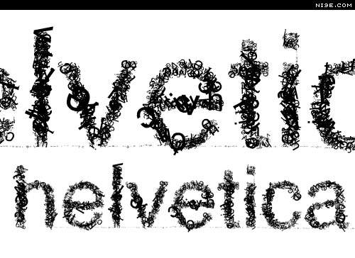
Typeface:
Helvetica
Helvetica originated in
Switzerland in 1957 and was designed by Max Miedinger and Eduard Hoffmann at
the Haas type foundry. This sans
serif font was originally named Die Neue Haas Grotesk, it was changed to
Helvetica in 1960 which is Latin for Swiss.
Helvetica was designed
to be neutral as it was based on the principle that “type itself should give no meaning.” Companies were looking for change after the European war and
to deviate away from the decorative and loud that had been used in
advertisements.
Although this type was
originally designed to inherently convey no meaning, it now represents
corporate culture and business because of its adaptability. Helvetica is clear,
direct and instantly legible, which is the backbone of most corporations; why
not use a type that reflects a mission statement, whilst simultaneously
advertising.
“Helvetica’s
sleek lines and modern sensibilities were just what companies were looking for
to remake their identities and set themselves apart from the past.” [1]
Helvetica is classified
as a transitional or anonymous sans serif with vertical and horizontal
terminations on their strokes and is as much about the negative space then
about the lines, whilst having monotone stroke weights.
Another interesting fact
is that the type remains legible whilst in motion which is a key factor for its
use in transportation signage and placement on moving objects.
“…a font that rides the line
between classic and modern, conservative and edgy, or elegant and relaxed,
Helvetica might just be your answer.”[2]
Helvetica is usually
categorized as a safe font, it doesn’t tend to influence the other elements
within a design, and it is clear and communicates the text/brand simply and
explicitly. Examples-Nestle, Toyota, Microsoft, Target, American Apparel,
American Airlines, Post-It, 3M, Skype, BMW, Panasonic, GM, Motorola,
Harley-Davidson, Tupperware, NYC Subway.
As a result of its
neutrality it is easily read without being disturbed with serifs or decorative
flicks, users just read and absorb. Although its modern (as it does not use
serifs) it’s not aggressive or overly harsh, it doesn’t shout the message, it
just simply communicates it. This is one of the reasons that it will work in my
letterpress. I can build on its impartiality. It will not interfere with m
design, but will enhance its understanding.

References
No comments:
Post a Comment
Note: Only a member of this blog may post a comment.