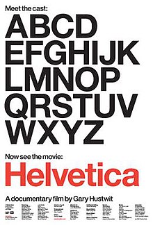
Helvetica is one
of the most popular typefaces of all time. Swiss typeface designer, Max
Miedinger was famous for designing the sans-serif typeface in 1957, firstly
naming it Neue Haas Grotesk. In 1960, Miedinger renamed the typeface Helvetica;
the Latin name for Switzerland and from them on it was global.
The Helvetica
design is based on the grotesques of the late nineteenth century. However, with
new refinements Helvetica has been put into the sans serif sub-category of
neo-grotesque. Not too long after
the introduction to Helvetica the Stempel foundry purchased the original
Helvetica typeface and then developed a full series of weights. Today Helvetica
is defined as an all-purpose type design, which is able to convey practically
any message effectively.
The traditional
design of Helvetica had the stroke endings squared off, however Helvetica
Rounded was soon after designed with rounded stroke terminations. Miedinger
sought to create a font that did not sit or float in the background. It is both the positive and negative
space around the type itself which make the typeface look as if it is fixed to
its background, with no possibility for movement.
To this day there
has been a number of Helvetica variations created, including a number of
different language variants. Each style consists of the same traditional design
however with both heavier and lighter stoke weights. Variations such as
Helvetica condensed and Helvetica compressed are largely used amongst display
applications such as newspapers and headlines, billboards and advertising.
Helvetica was designed
as a rational typeface for contemporary information. It is a neutral typeface
and although Helvetica has many variants the basis of its structure follows the
horizontal slicing off of the terminals. It is this neutrality, which makes the
font so widely used, because it has no meaning for itself and allows for words
and sentences to be able to relay their own message effectively without
creating any interference.
Although it can be
argued that Helvetica has become so overused, Helvetica is still seen as one of
the most popular body context fonts. Used by major companies such as Apple and
NASA, some designers will argue that Helvetica has lost its power over the past
fifty years because of its exhausted use while others will say it is the
timeless nature of Helvetica which makes it a popular choice when choosing a
typeface.
Works Cited
Bart,
Zach. Zach's Blog. 12 11 2008. 21 07 2012
<http://zachbart.wordpress.com/2008/11/12/helvetica-critique/>.
Bitstream Inc. My Fonts. 03 12 2007. 21 07 2012
<http://www.myfonts.com/fonts/adobe/helvetica/>.
Chapman, Cameron. The Simplicity of Helvetica. 21 07
2012
<http://www.webdesignerdepot.com/2010/01/the-simplicity-of-helvetica/>.
McDonagh, Maitland. Helvetica: Review. 21 07 2012
<http://movies.tvguide.com/helvetica/review/290467>.
The New York Times. Helvetica: The little typeface that
leaves a big mark . 01 04 2007. 21 07 2012
<http://www.nytimes.com/2007/03/30/style/30iht-design2.1.5085303.html>.


No comments:
Post a Comment
Note: Only a member of this blog may post a comment.